‘Diagram,’ almost like an opening title, is the first term in the unique introduction, or “prologue,” of the first book dedicated to the work of Beto de Volder, published by Adriana Hidalgo in 2011. The volume belongs to “Los sentidos” (The Senses), a collection of monographic editions on mid-career Argentinian artists in full activity. Instead of a text, the two opening pages enumerate the leading components of De Volder’s extensive artistic vocabulary: supports, fabrics, papers, MDFs; several sizes, forms, and technical resources; single, double, curved, and counter-curved lines; and the sum of artistic connections, tendencies, and modalities related to the language he has created and with which he has been promptly identified. A sort of map of his poetics.
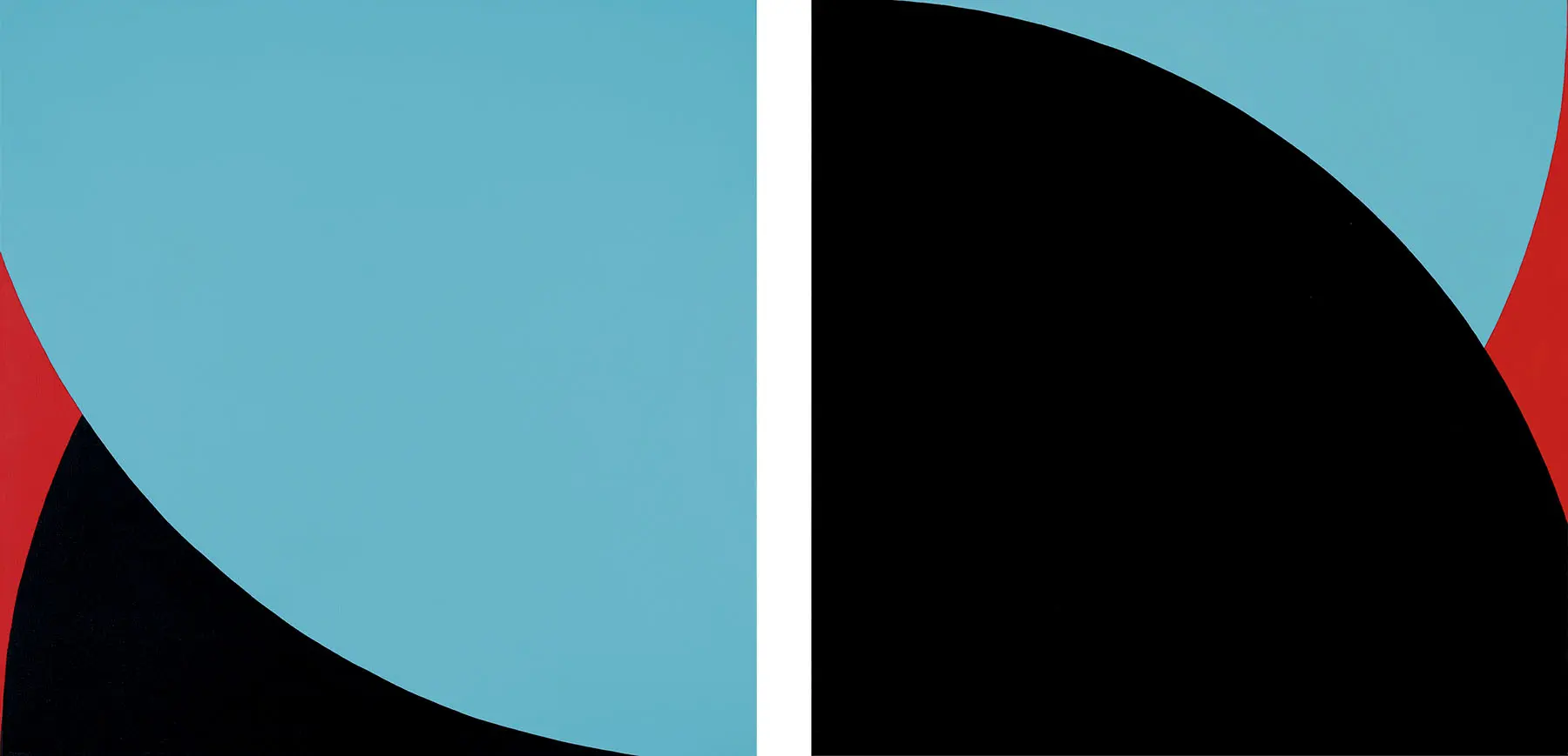
Beto de Volder’s wealth of resources and sources of inspiration is varied and eclectic. Graphite and pencil have turned the line into the protagonist of his works. The ABC of drawing was the launching pad for his long-standing and constant trajectory. Later, the mostly curved line rose to prominence—either open-ended or closed in itself, and dynamic to the point of bordering on the kinetic—and became crucial to this artist’s oeuvre. Of all the different resources, techniques, and mediums, graphite was perhaps the foremost. And both variety and numbers have prevailed: single or double lines and changing shapes such as circles, ovals, ribbon-like… Multiple combinations make up a vocabulary that, although abstract, has managed to become synthetic and at the same time dynamic, eloquent, and prolific. It’s almost as if the goal were infinity without denying repetition, which seems essential and also parallel to a plurality of variations that are never identical, but approximate. This penchant was transformed into a formula that defined his project, an overall idea towards a tacit plurality and abundance of forms. Mies van der Rohe’s dictum “less is more” comes to mind. The elements that comprise Beto de Volder’s artistic language add up to a restricted combination; as if the artist had proposed a broad horizon by way of a self-referential, self-empowering impulse. The central element is a line that nonetheless has become multiple and infinite.
On the other hand, the mere naming in Beto de Volder’s “diagram” of Jean Arp (1886-1966), one of the leading Dadaists of the early 20th century, adds an interesting angle to the understanding of his production, suggesting aesthetic connections between the two. Arp’s sculptures, though often in bronze, allude to soft forms that could be interpreted as biomorphic in a broad sense. In tune with a spirit close to that of the Franco-German artist, some works by the Argentinian made with aluminum tubes and generally painted with red or yellow enamel, mark a difference with previous acrylics on MDF, whose thickness was almost flat. In my opinion, these pieces also suggest connections to a biomorphic spirit, an underlying vitality; as if they possessed, in their own autonomy, a certain animality or humanization. This relationship may seem peculiar, but it’s a possible step in the process of interpreting some of the artist’s works.
Returning to the line—De Volder’s leading concept and the identifying mark of his artistic language, although traversed with affinities and relationships with various movements and directions—it’s worth recalling a historical and well-researched international group show titled “On Line. Drawing Through the Twentieth Century,” curated by Cornelia H. Butler and Catherine de Zegher for New York’s Museum of Modern Art in 2010. The roster of artists included Kazimir Malevich, Vassily Kandinsky, Lucio Fontana, Jackson Pollock, Lygia Clark, Georges Vantongerloo, and Julie Mehretu, among many others, and the selection of works spanned the hundred years between 1910 and 2010.
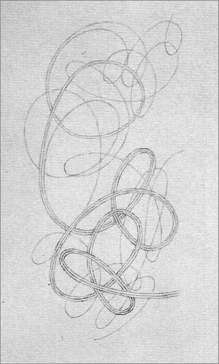
The curve is said to be the core element in De Volder’s work. However, given the increasing focus on the line for those concerned with the evolution of his work, I recommend a greater precision when referring to the curved line as a central protagonist in his language, albeit not the only one. This statement is not meant to be redundant since for some time now the line has had an increasing presence in the language of contemporary visual arts, especially in drawing, but also in painting, and even in objects. Beyond the line, De Volder always chooses to combine it in very open and varied ways. The earliest examples may have been the multiple “arabesque” (my denomination) drawings from 2006, as well as another series in graphite on paper, with vertically and tightly grouped semicircles composing soft forms. A very original series from 2007 features soft and undulating forms created with fine pencil lines that achieve a corporeal, tubular effect.
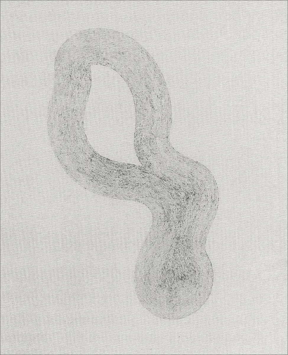
The curved line has kept its presence in other ways, such as in the 2011 yellow tube that illustrates the cover of the book issued by Adriana Hidalgo publishers, made of painted aluminum and whose free and open curves zigzag in a hypothetical motion, creating a visually agile and swirling presence. In “Doblador de milongas” (Milonga Bender), one of the book’s most interesting essays, artist Alberto Passolini relates De Volder’s curves to no less than the traditional urban music of Buenos Aires: tango and especially milonga, with its sprightly, zigzagging rhythms, whose dancing steps translate into firuletes (the porteño slang word used to describe playful and fast turns). Passolini goes on to draw a parallel between Piet Mondrian’s Broadway Boogie Woogie and the milonga. Not by chance, De Volder was born in Nueva Pompeya, a coastal neighborhood in Buenos Aires and the cradle of tango and milonga. This analogy therefore enriches the meaning and exegesis of the work of this Porteño who now lives in New York. Finally, and paradoxically, De Volder today is closer to Broadway and its musicals than to Buenos Aires’ tangos, although his life’s tempos, contrary to those of his work, no longer need to be in step.
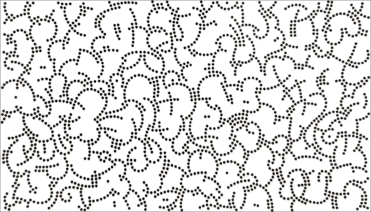
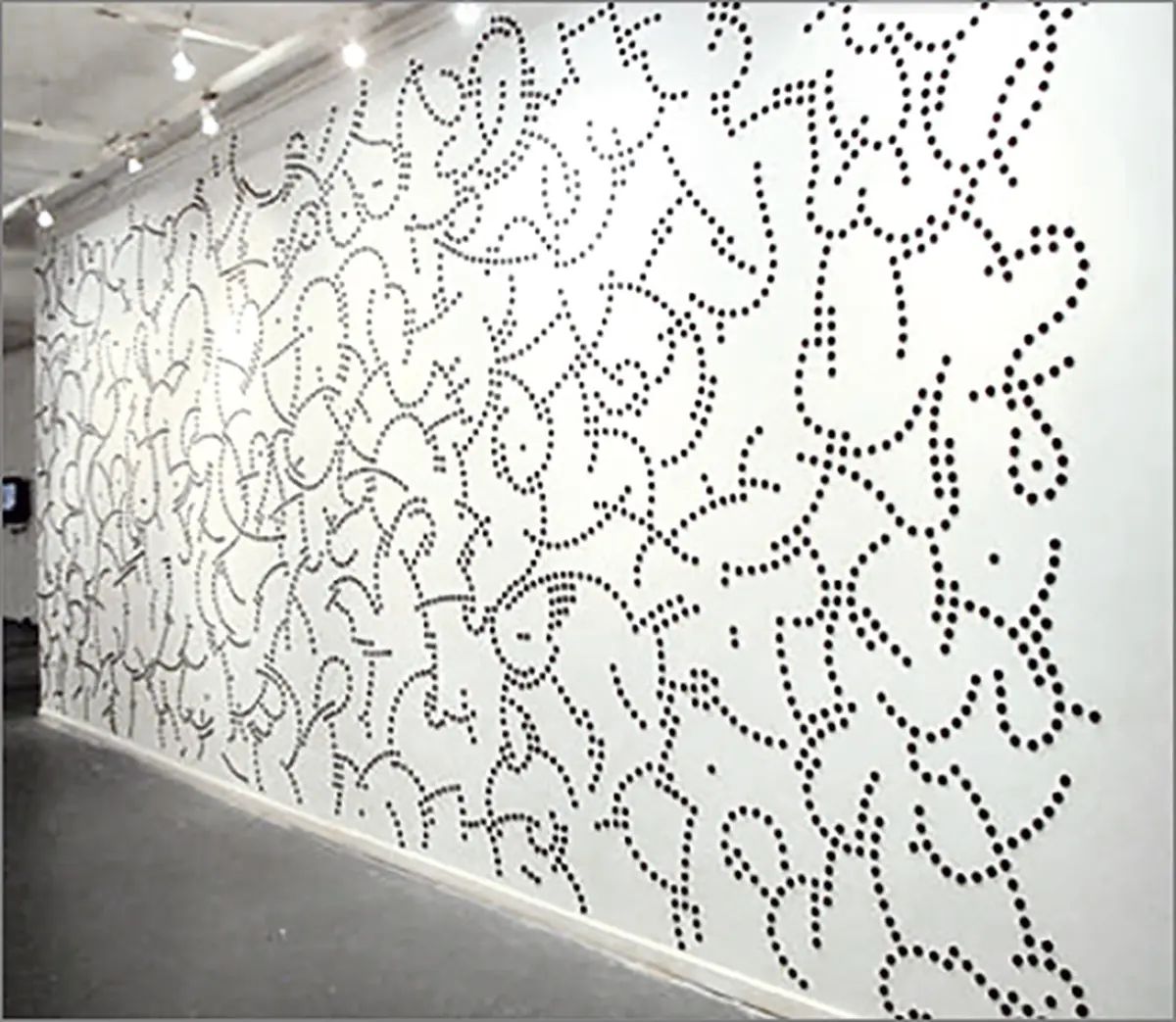
Since I cannot refer here to all the stages of the artist’s development, I have chosen two series. In his work created for “PLC, Punto, Línea, Curva” (DLC, Dot, Line, Curve), hosted by the Centro Cultural Borges in 2011, the leading line branches into fragments of undulating lines composed of successions of black dots on a white background; this black EVA foam wall-installation measured 300 x 800 centimeters. Another very similar one was installed in the MALBA restaurant (Eduardo F. Costantini Collection, 2011).
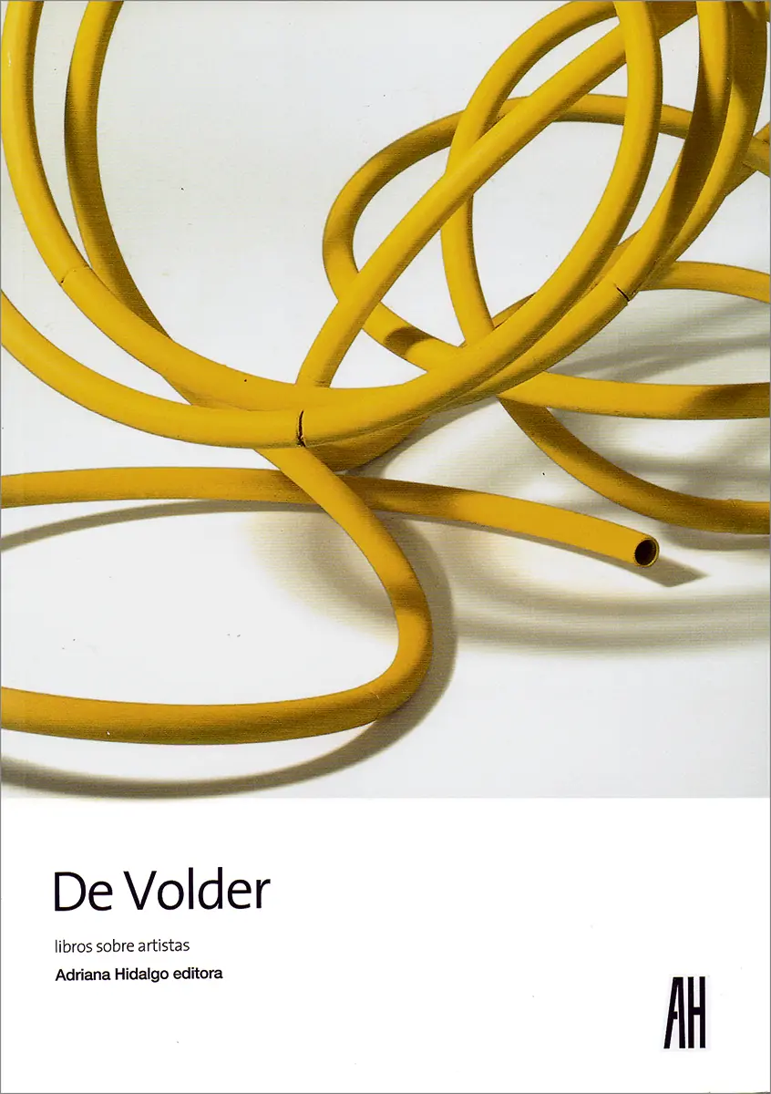
To conclude, I’ll refer to a set of small-format abstract works on 29 x 21-centimeter paper. The background is black and each one is composed of a single image. These are graphite-colored line drawings whose strokes are not hidden. Although they are all abstract, they surprisingly acquire a certain soft corporeality created by the very treatment of the graphite. The figures, even in their silence, possess their own identity. The very strokes within each figure create a subtle volume. On page 138 of the aforementioned book, something like a fine aerial structure internally “supports” an abstract figure that is flat, though a certain volume is also perceived. The other forms may have been conceived in a similar way, but no trace of the line structure remains. “Arguably, what De Volder has been doing since he returned to art is to think not of geometric bodies, but of geometries as bodies.” A striking conclusion by the Argentinian writer Santiago García Navarro, since it preceded Beto de Volder’s most recent series, made of ocher-yellow figures on a greyish-blue background.
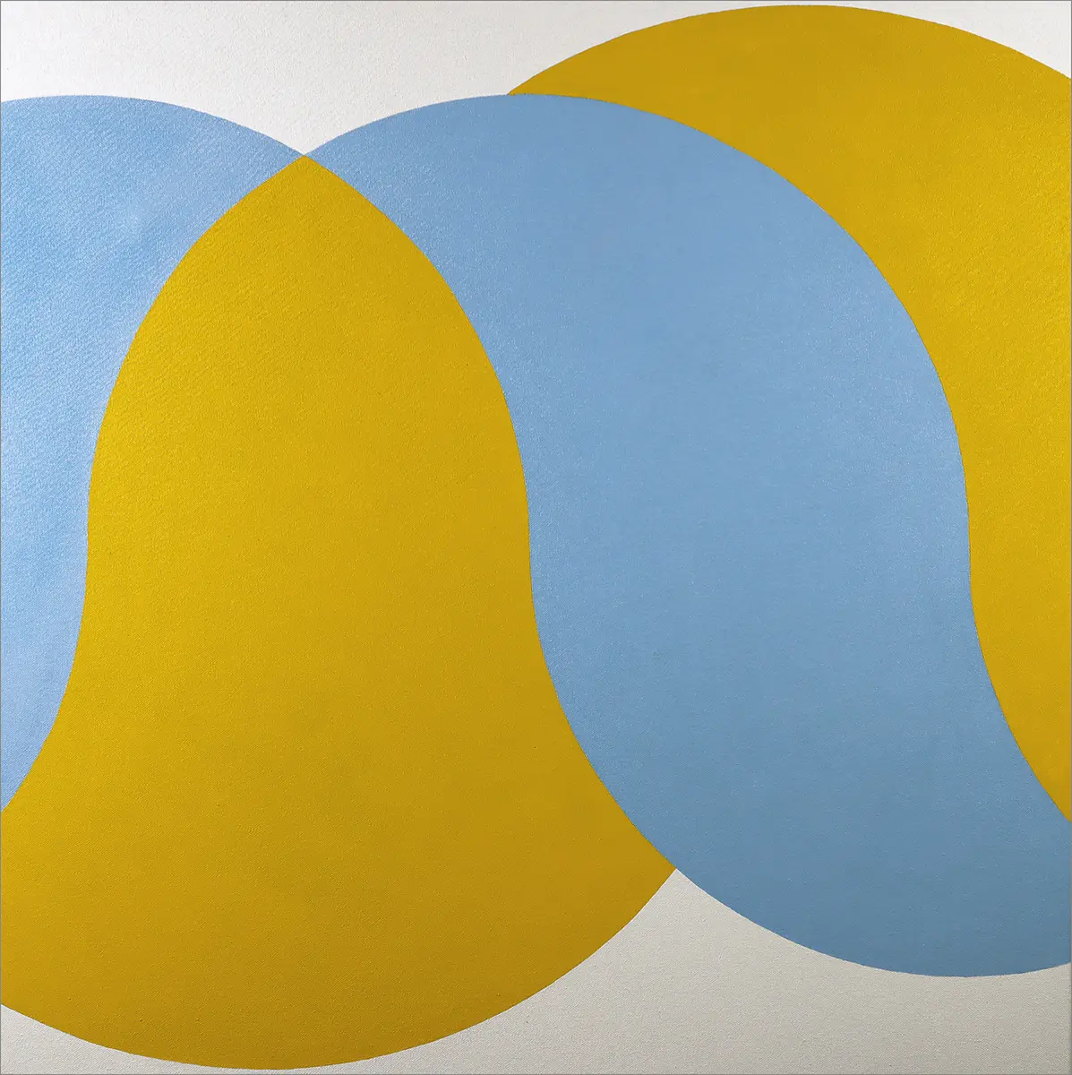
After his protracted trajectory, the artist keeps expanding and searching for poetic innovations. Thus, after leaving aside his fretwork, perhaps temporarily, he has been producing flat figures that—although it may seem contradictory—nonetheless display a very eloquent corporeality from the perspective of each individual image. Finally, a playfulness that is central to the artist also stands out in these works; one that ultimately defines his vitality.
* Courtesy of the artist and Del Infinito
MERCEDES CASANEGRA