The birth of an autonomous color universe: such is the sensation provoked by the work of Renata Tassinari, recently in view in the solo exhibition A Espessura da Cor (The Thickness of Color) at Lurixs: Arte Contemporáneo, in Río de Janeiro. Curated by Felipe Scovino, the exhibition featured fifteen works—ten paintings and five drawings (paintings on paper)—created between 2015 and 2017, all based on planes rendered geometric by colors on paper or acrylic structures instead of canvases, the result of an investigation the artist has been carrying forward since 2003.
After years refining her handling of color, Renata Tassinari’s career has reached a peak, attested by the smooth and homogeneous surfaces of her works. Materiality, solidity, saturation, and shine are some of the chromatic elements she investigates in-depth, in a process of tonal purification that has color almost acquiring a life of its own: those elements accompany the motion of light as it penetrates the acrylic plaques and returns to the viewer’s eyes densely and at the same time with weightlessness that comes from the sensation of color levitating.
By choosing unexpected hues and acrylic boxes, Tassinari brings her work closer to design, based on a key that has been widely explored in contemporary art and its “mondrianesque” predecessors, for Brice Marden and Barnett Newman.
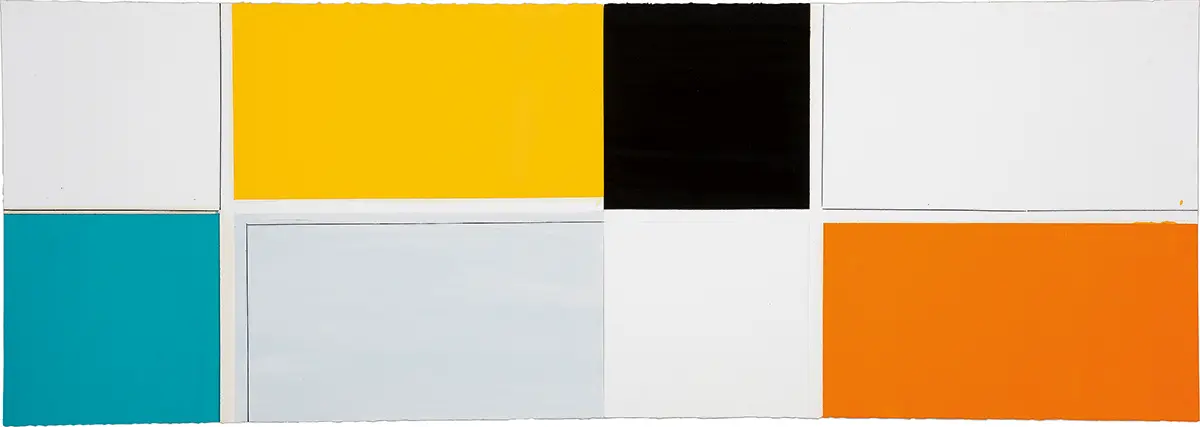
The surfaces that Renata Tassinari creates are synthetic, effulgent, and delineated by clearly outlined geometric shapes—yet, they raise doubts: are these stand-alone, juxtaposed squares and rectangles, or is it a continuous surface? Is the painting made on canvas behind the acrylic box, or are colors applied directly onto the industrial material? It is key to understand Tassinari’s work as a minimalist experience. Overcoming the traditional notion of the need for support and studying the aesthetic possibilities of the composition—not in terms of painting or sculpture but by means of two- or three-dimensional structures that can be seen as “objects”—are strategies that reveal art’s phenomenological ability to provoke an experience.
Renata Tassinari says that the structure of her works is inspired by an urban architecture—façades, doors, windows—of exclusively straight lines and angles. The design of the structure of the paintings is transformed into 5-cm deep acrylic boxes. The interior part of those boxes is painted in acrylic, while layers of oil paint are applied to the exterior, without overlapping. The contrast between the materials and their characteristics, the shine of the acrylic plaque, the opacity of the oil paint in the exterior wood plane, plus the white thread along the edges of the support create a volume that projects the painted planes onto space.
A graduate in Fine Arts from the Armando Álvares Penteado Foundation (Faap-SP), Renata Tassinari began her career making paintings that combined figurative elements and plastic gestures, features that were among the highlights of what is known as the 1980s generation. These elements gradually faded from Tassinari’s work as she engaged in an investigation into color, which became the distinctive characteristic of her production. She explored chromatic aspects based on their relationship with matter and with the support, adding to the surface of the canvas sundry elements such as sandpaper, wood, rubber, cardboard, lead, etc., or deploying techniques like encaustic and synthetic varnish along with oil paint.
Colors and materiality produce an impression of relief, but the structure is completely flat. In the eyes of the viewer, this is almost a magic trick. And here we see another one of Tassinari’s resources: she creates her own chromatic palette, and all hues are welcome. “To transmit this expansive character to color is definitely no mean thing. To transform color into something that magically moves towards space and, in other instances within her oeuvre, can fold or gain thickness, as is the case with her recent paintings that create the image of a fracture, as I wrote not long ago, are notable characteristics in the work of this artist,” said curator Felipe Scovino.
In the exhibition, the Lanternas (Flashlights) series, comprised of painted acrylic modules installed on a wall to form parallel vertical or horizontal lines, produced the illusion of actual light beams. “On the basis of the Lanternas, all the works saw their relationship with space increase,” said the artist. The most recent set in the exhibition, titled Beiras (Edges), was a development of the Lanternas, apparently more economical in their shape (narrower) and color composition (diluted tones).
In the painting on paper, which Tassinari preferred to call drawings, the plane was divided by pencil lines that formed squares and rectangles. Some of the fields are selected for treatment with oil paint in intense or soft hues. Both display a touch of lightness, as if paper, being so fragile, required a more fluid contact. “In times of accelerated inattentiveness, this artist’s works call us to slow down and appreciate the details, the minute elements, the singularities,” said curator Felipe Scovino.
ALESSANDRA SIMÕES