
Talk to Me: Design and the Communication between People and Objects is a new design exhibition at the Museum of Modern Art. Curated by Paola Antonelli, who also organized the 2008 exhibition Design and the Elastic Mind, 1 this show comes across as a de facto sequel. I went twice and must say I liked it better the first time. It’s an exhibition in which the value of the whole far surpasses the quality of its parts. On the second visit, as I paid more attention to each individual object, I found my initial excitement fading away. Nevertheless, the accumulated experience raises many interesting questions.
The exhibition is composed of objects and videos that focus not only on information and its processing, and possible translations, but also –as the title expresses– on interactions with the viewer. The exhibition is somewhat overwhelming in the number of displays. A cramped presentation is to be attributed to the limited space made available for an exhibition that deserved much more. And many of the individual displays flirt with kitsch and cuteness. Yet the show, overall, by departing from what one normally expects of art exhibitions, presents new angles from which to discuss art.
In her introduction to the catalog, Antonelli points out that by 1960 design started to shift away from the hitherto classic twentieth-century premise that “form follows function” to an awareness of objects as forms of communication. Early on, communication was taken literally, referring to the transmission of data, introducing meaning. It did not yet extend to incorporate the idea of interaction between object and person. But the introduction of meaning, alone, provided a major paradigm shift helping us to analyze the design in a different light.
Functionalism, in hindsight, appears as an aesthetic style, not just the product of a logical equation. It proposed a form of tautology and predicted later uses of tautology in minimalist and conceptual art. Under the guise of usefulness, objects were reduced to talk about themselves. A good and nicely designed hammer, for instance, would have all the elements that speak of “hammerness”, but nothing more, since any other information would constitute “noise.” It could be said that orthodox functionalism in design was discovering meaning about the same time that art was discovering meaninglessness. The design was enriching itself by going outward, while art was going into self-analysis. Both were opening new perspectives.
The MoMA exhibition itself doesn’t ponder any of this and didn’t intend to. To be successful it didn’t have to. Talk to Me is a deliberately eclectic show in which both functional and non-functional objects are displayed. The point and backbone of the whole event is the two-fold vision of objects communicating — on the one hand possessing meaning, and on the other becoming complete through interaction with a “user”.
Those objects communicate something is nothing new. After all, the early functional residence (the habitation machine, as Le Corbusier would put it) tried to visually proclaim itself as simply that: a place to live in, nothing more. After the seventies, post-modern architecture used to design not to communicate its purpose as a structure but to tell us about ice cream sundaes or Greek temples or a mixture of both. By focusing on communication, Talk to me avoids these pitfalls.
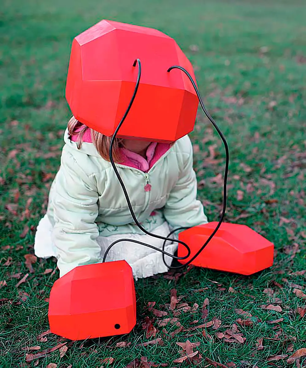
The title of the exhibition suggests it might take an anthropomorphic approach to design, and in fact, many of the pieces in the exhibition do a riff on anthropomorphism. Robots, after all, were and often still are uselessly patterned after the human figure, even when the purpose of the design is to perform human tasks that could be dealt better with non-human shapes. In the more anthropomorphic displays in Talk to me, the concern is with empathy, the attribution of human or emotional qualities to inanimate objects. A tamagotchi psychology shows up in several pieces. Tamagotchis are digital pets that have to be nurtured like real pets so that they stay “alive.” While traditional tamagatchis do not appear in this exhibition, other devices displayed in the show seem related, such as James Chambers’ tongue-in-cheek “sneezing radio” — when too much dust accumulates on the grill covering the speakers, the radio sneezes to get rid of it. Another Chambers piece is a lamp that is turned off by being strangled. And the Attenborough Design Group has constructed an external computer hard drive that extends four legs to separate itself from liquid when it senses a spill on the desk.
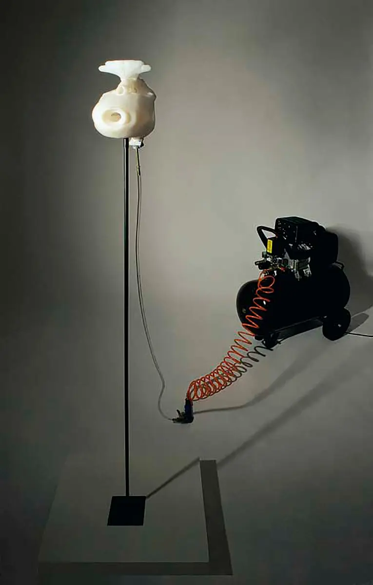
There are no talking cars in the exhibition, like those of the 1980s which, instead of using warning lights, annoyingly exclaimed: “trunk door is open” in robotic English. Some of the strongest pieces, however, actually do talk to us one way or another, and in more revealing ways. Alex Metcalf has installed listening devices in tree trunks so that one can hear the sounds of water being absorbed and circulated. Chris Woebken reconditions billboard structures so that they become habitats for bats. The contraption interprets the call and flight patterns of bats, as determined in scientific studies, and uses especially designed software to translate events in the behavior of actual bats into a text that’s displayed simultaneously on a billboard (e.g. “Bats taking off for insect snacks,” or “Bats returning from picnic”). In another piece, Marguerite Humeau uses an analysis of the remains of prehistoric Lucy (Australopithecus afarensis, found in Ethiopia in 1974) to reconstruct her voice box and thus recreate her voice. In contrast to the talking cars of the 1980s, design projects like these bring science and art together, following Paul Klee’s dictum of 1920 that art is there not to reproduce the visible but to make the invisible visible.
The exhibition also explores the translation and visualization of information. Some works make interesting incursions into ethics and political action in ways not possible with what might be called “static design.” These displays, regardless of their quality, lead the viewer to reevaluate the “observer’s approach” that museums traditionally expect of their public. Pedro Miguel Cruz, Penousal Machado, and Joao Bicker construct a model for tracking traffic flow, producing an animated map of the routes taken by 1,534 taxis during one month in Lisbon. Michal Migurski’s Walking Papers invites everyone who wishes to participate to register geographic points that are personally important to them. The results are maps that are more than a recording of physical geography, they reflect a flow of meaning. Objective data is overlaid and distorted by data related to subjective interests and values.
Some pieces go further. The Newsmap by Marcos Weskamp ranks the news by rectangular sizes determined by the number of entries they have in Google News. The item that a man was arrested for hacking Scarlett Johansson is shown to have the same size as an earthquake in Bali in which dozens were injured.
Wesley Grubbs and Nicolas Yahnke compare the expenditures of the U.S. government on different activities with the amount of media coverage these activities receive. The result is arresting both visually and politically. In one circular graph, military expenditures are shown taking up about 70% of the total surface of all expenditure, while a companion circular graph depicting media coverage has military activities taking up an area of no more than 5%. Education on the other hand is shown to have expenditure so small it is practically invisible on the graph depicting government expenditure while receiving at least half as much media coverage as given to military issues.
In They Rule, Josh On invites the public to draw “maps of influence.” By typing in names chosen from a list, the viewer instantly “discovers” links between corporate boards. Sometimes the same person sits on as many as seven boards at once. What artist Mark Lombardi once did laboriously with index cards (showing the connections between the Bush and the Bin Laden families), can now be done with a few keystrokes on the web (theyrule.net).
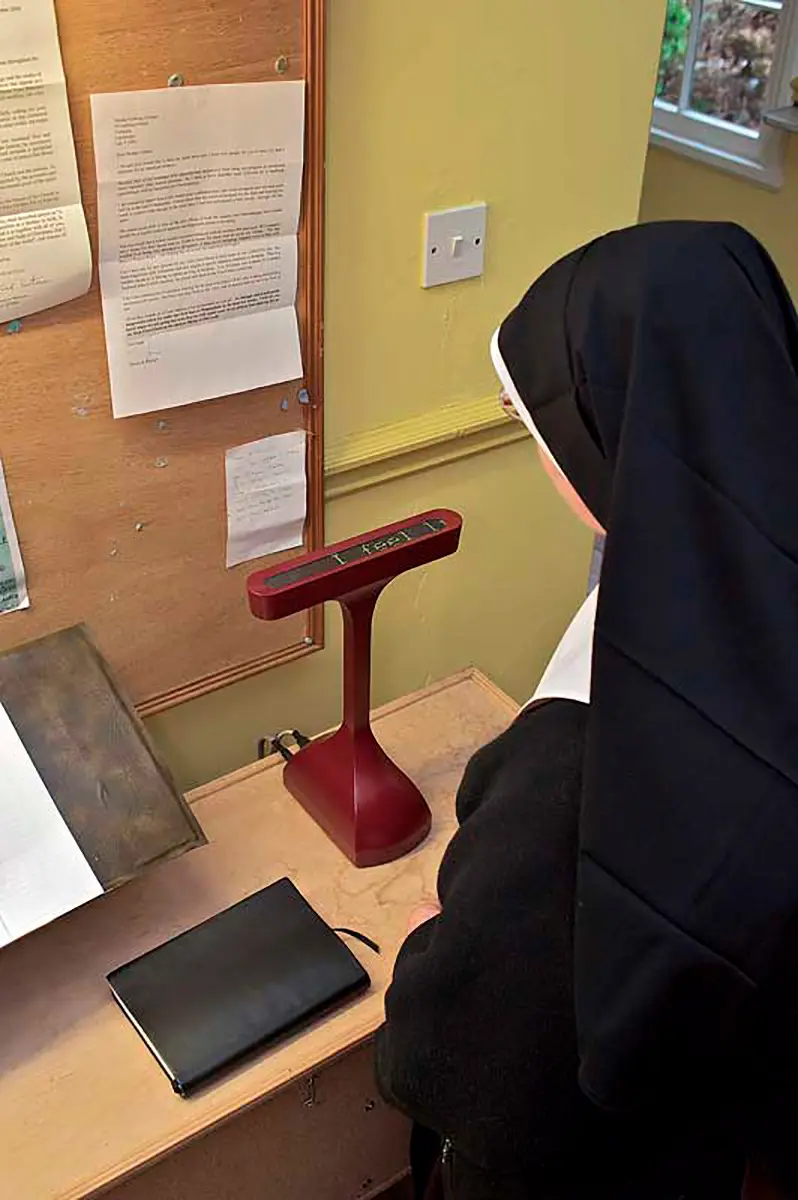
Other pieces in the same vein are somewhat less pointed. BBC Dimensions, for instance, brings historical events into the local scale, transposing the surface dimensions of the pyramids in Egypt onto a neighboring parking lot (a very big parking lot). Interaction Research Studio constructs a Prayer Companion for nuns in isolated convents to keep their praying up to date — a small and private ticker tape screen on which flashes the latest disaster news.
Surprisingly, there is no mention in the show of Corning’s advertisement A Day of Glass (http://www.youtube.com/watch?v=6Cf7IL_eZ38), which displays a future in which a large proportion of the tasks of daily life are carried out through interactivity with surfaces conveying massive amounts of information at the slightest touch of a finger. Dream or nightmare, the Corning video surpasses in scale and visual refinement everything else in this exhibition. Nor is any mention made of Numi, Kohler’s new toilet that has a heated seat, washing, drying and music service, and a beam that adjusts the height of the seat according to need and gender. (To help justify its price — $6,400 U.S. dollars — Numi points out there are savings in the amount of water flushed.
The fact that commercial projects like these are not included in this exhibition actually helps to give Talk To Me a sharper focus. There is no attempt here to sell us a technological Utopia or to celebrate consumerism. The whole thing is about opening a space for the discussion of ideas. Although the ideas presented are rooted in technology, the interest is in revising thinking processes not in updating technical knowledge.
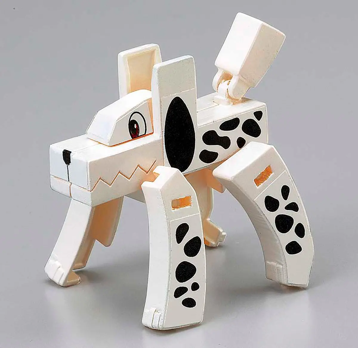
Shigoru Ishisuka’s Mojibakeru consists of a series of pieces inspired by the Transformers, but with pedagogical impact. One starts with Japanese kanji pictograms (the Chinese characters used in modern Japanese writing) and then articulates them into what the pictograms stand for. It is like having the word elephant with the letters built in a way that one can reorder the parts to take the shape of an actual elephant. Frank Warren’s Postsecrets is a social networking project inaugurated in 2005. People send postcards anonymously sharing a secret they have never told anybody before. (Somebody confesses to defecate in the bathroom at work to feel that the action is paid by part of the salary. A writer doesn’t describe sex scenes in his novels in case his or her parents read them. A policeman locks himself into the patrol car to cry.) Aside venture of Postsecrets is the International Suicide Prevention Wiki, with an even broader social impact.
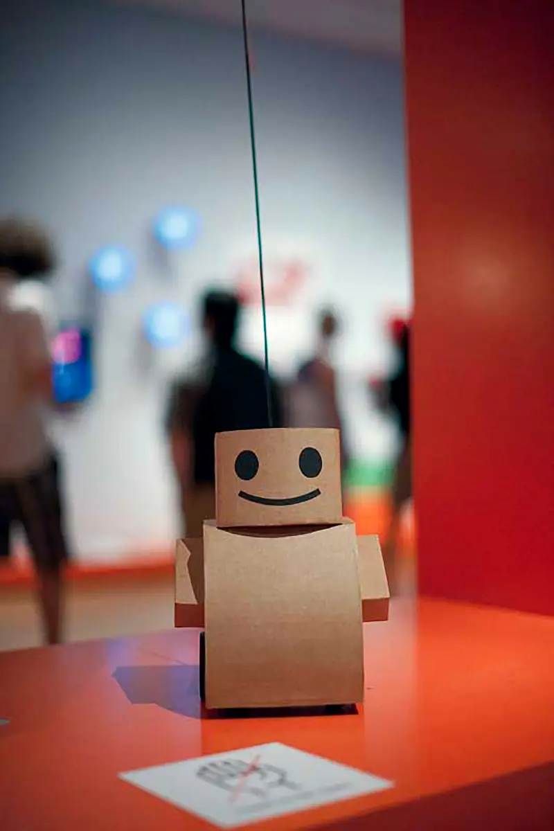
There is also room for performance pieces that might as well belong in a normal art exhibition rather than in an exhibition related to issues of design. Kacie Kinzer’s Tweenbot is a little cardboard robot that tries to cross Washington Square in NY. Operated by batteries, it easily hits the curb or a bench, or a tree and is stranded. Passers-by actually stop when they see the bot blocked and stoop to help, removing the obstacle or redirecting the bot on its way to its destination, as indicated by instructions on a little flag it carries. Against all expectations, no one steals, kicks, or crushes it. That people turn out to be helpful to this “toy” suggests something positive about New Yorkers, something having to do with playfulness, altruism, curiosity, pleasure in cleverness, the possibilities are many. It makes one consider the possibility that if a design is cute enough, an object will be protected from violence.

Maarten Baas has two projects side by side. One is what seems to be an analog-digital clock, but really is a video in which somebody cleans or paints into the original digital zeros from behind on a piece of glass. By opening or closing bars the numbers shown indicate the correct time in each particular moment. Next to it is the Sweeper’s Clock, another video in which two garbage sweepers move the garbage to form the needles of a clock that also show the correct time. During my first visit to the exhibition, both pieces were showing exactly the same time and moved in synch. It left me convinced the two “clocks” were part of a single piece. During my second visit, however, the sweepers were 7 minutes behind the analog clock, which I suppose could lead to the conclusion that painters are more punctual workers than garbage sweepers.
By the time I made my second visit to Talk to Me, MoMA had opened De Kooning: A Retrospective2 on another floor of the museum. It is a remarkable overview of the artist’s work and follows the traditional path of nostalgic explorations of the achievement of a master of the recent past. The show underlines individuality and authorship expressed through painterly (and some sculptural) passion. Talk to Me, on the other hand, regardless of the quality of the works, maintains the vibrancy of prophecy, demands a dialogue with art, and focuses on problem-solving and the search for elegant solutions. Seeing both exhibitions in sequence made clear that while subjectivism is celebrated in one, transformative contributions are extolled in the other. The de Kooning show is there to examine a closed chapter, one that was exciting while it was developing, but one whose value today lies in the archival category. Talk to Me instead of announces what may or will happen with our culture and the struggles involved in the process.
(Edited by Selby Hickey)
NOTES
1. Talk to Me: Design and the Communication between People and Objects, Museum of Modern Art, New York, July 24–November 7, 2011.
2. De Kooning: A Retrospective, Museum of Modern Art, New York, September 18, 2011 – January 9, 2012.
LUIS CAMNITZER
Uruguayan artist. Emeritus professor at the SUNY College, Old Westbury.